
Knowledge Hub Designing an Experience they won't forget Feb 15, 2022 10:23:05 AM Grant Collins 2 min read
Planning how all your attractions will fit together, and not waste your space (where every bit costs you) but also not feel too claustrophobic is essential to creating the welcoming feel you're aiming for! But how do you do this?
The first step is to create a mock it up on cardboard, to whatever scale you can practically play around with, making sure to mark in any fixed objects that aren't negotiable ie Supporting Pillars. Then cut each attraction out of a different bit of card so they can easily be moved around within the space. Then explore options, move them around see what feels right before modelling the space in Sketchup or Cad.
Paying particular attention to site lines from where your staff will be placed, in a quick example;
If the counter was in black, and attractions laid like this. There would be multiple potential spots, with the counter unable to see 3 of your attractions! (Vision marked in grey) Each blind spot potentially means more staff needed to man the attractions, so more ongoing costs.
Once the site lines are more or less sorted, draw foot traffic, to see a heat map, ie where do guests go-between attractions, can they easily find bathrooms, where are the potential choke points.
Drawing each customer potential journey, then overlaying with the next and the next, so you can see heat maps of where there are busy areas, cutovers and more. This will allow you to ensure that the circulation passageway through the spaces follows an easy and economic pathway from the door to all the other main activity areas.
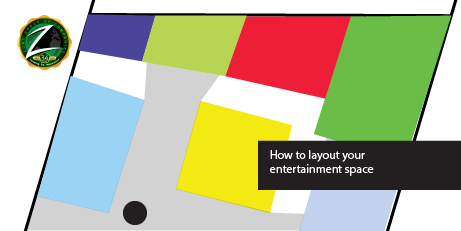
In terms of overall design, there are a lot of things to consider;
- Do you change floor types between areas to signify the activity, or do you use lighting to do this?
- If you want them to feel separate, floor is a good way to do so. Conversely, if you use the same floor style in two spaces adjacent to each other, they both feel larger as you’re more or less borrowing some of the space from the adjoining attraction.
- When planning decoration and lighting, work with the principles that vertical lines draw our eyes up and horizontal lines draw them across to extend or reduce the proportions of a room. Angles bring focus to what they lean towards. These work in combination, so light is a great way to create focal points within the space.
- Perception of space is based on body size. Different size spaces suit different size people: one person’s claustrophobic box is another’s cosy nest. So make sure you consider each space, and passage from the height of a child to a 6 foot adult. Along with wheelchairs, larger builds and all the in-betweens. Ie if your fence around an attraction is 1.2M, kids can’t see over it, so consider using some glass windows/separations so they can see what is on the other side.
- Some attractions ie Laser Tag are concealed in a space, others like bumpers are low lying so can easily be seen over, so consider the heights and nature of the attractions during the placement phase.
- Some attractions are required to be X shape ie bowling, others like gokarts/laser can be multiple so I’d start with the fixed space attractions, then do the ones that can be more flexible. Some have requirements ie Plumbing, ventilations, so try and make sure that these are in logical places to each other as well.
To learn more about specifically designing a Laser Tag Centre layout, please read our more detailed guide

Grant Collins
Sales and Business development for Zone Laser Tag. Owner of the Space Llama group of companies, which runs multiple FEC's in New Zealand.